HIDDEN BITES (TOUCH POINT JOURNEY)
There are a number of apps where people can look through to find new places to eat such as Google, Yelp, and World of mouth. This includes restaurants of all kinds such as chain restaurants, small, owned business restaurants, dine-in restaurants. Currently, there isn’t an app where you can solely and effectively look for small, owned restaurants in the local area that you are in. People and influencers often post small, owned restaurants on Instagram, reddit, and Tik Tok. This leads to people searching for restaurants like these in inconvenient places and takes up more time than needed. The main issue is that there is a persistent need to help local and hole in the wall restaurants, but there isn’t a main platform to showcase all these restaurants.
The purpose of this project is to create a touch point journey to help customers with the overall experience of searching for local small, owned business restaurants. A “touchpoint” is any point of interaction a person has with your company. Touchpoints are across a customer’s journey from when they first look at a product al the way up to when they purchase it. There are five main touch points in the touchpoint journey such as awareness, planning, waiting, experience, and follow up.
For Hiddenbites the main goal of the company is to get as many people as possible to sign up for membership. It is a free resource app to find local restaurants in any city in the USA, but memberships can be bought to receive exclusive deals, merch, and an interactive personal experience. This in turn encourages tourism for the cities, boosts economic growth, and helps locals. This company’s mission to help people reach unique delicious foods in a more accessible way wherever they are.
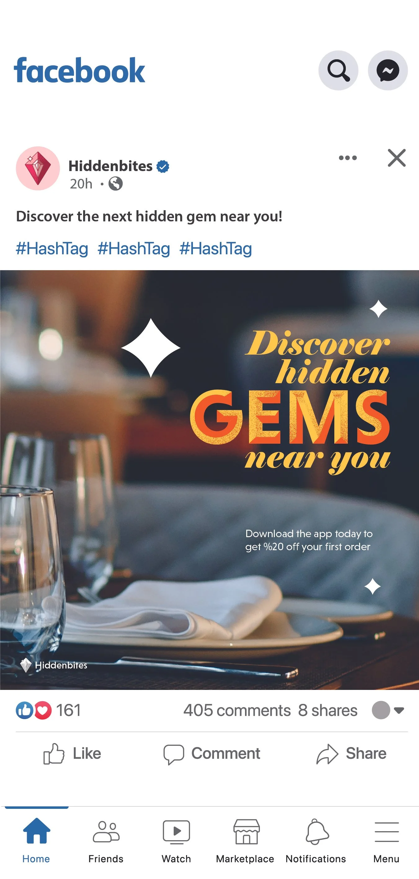
AWARENESS
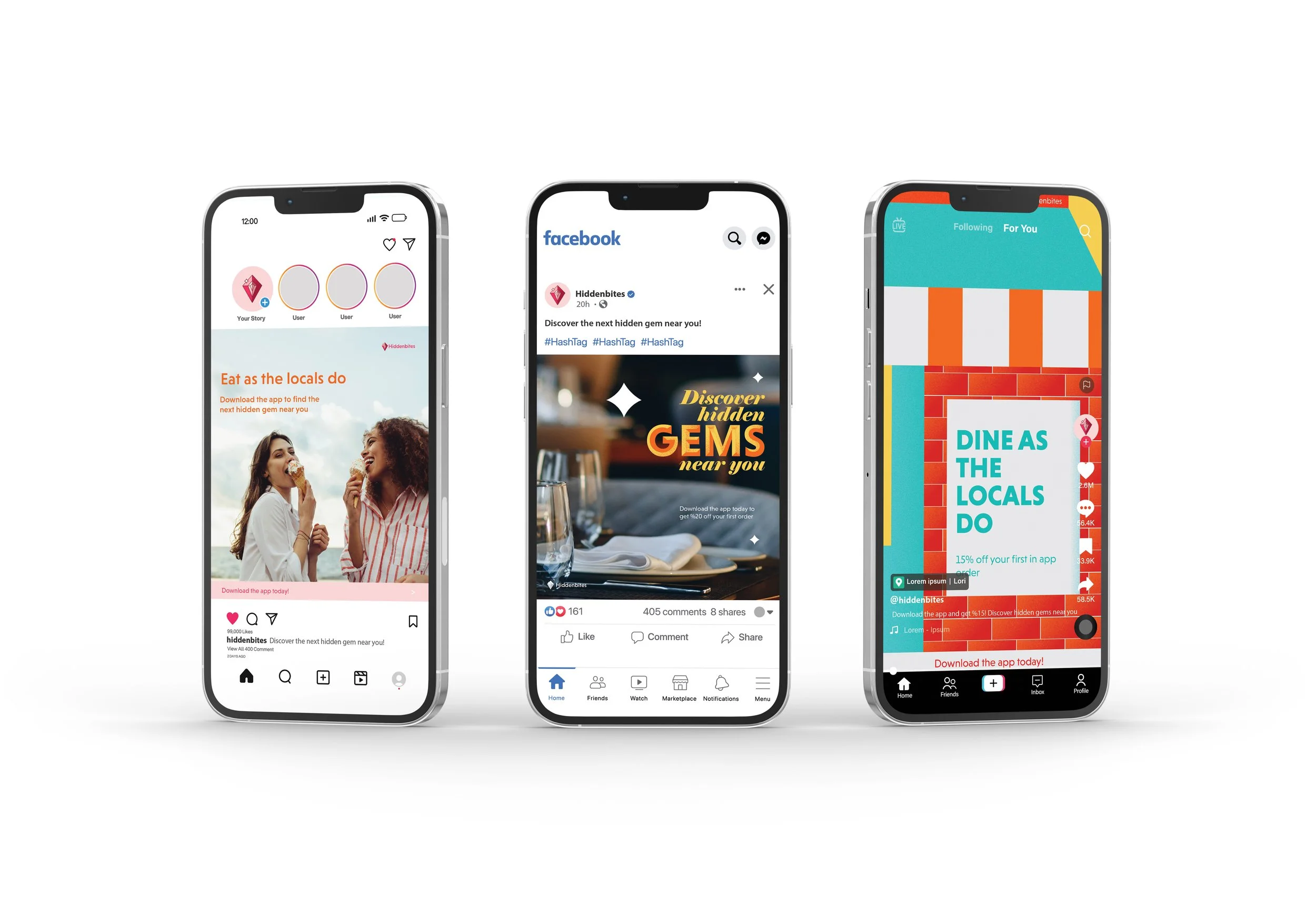
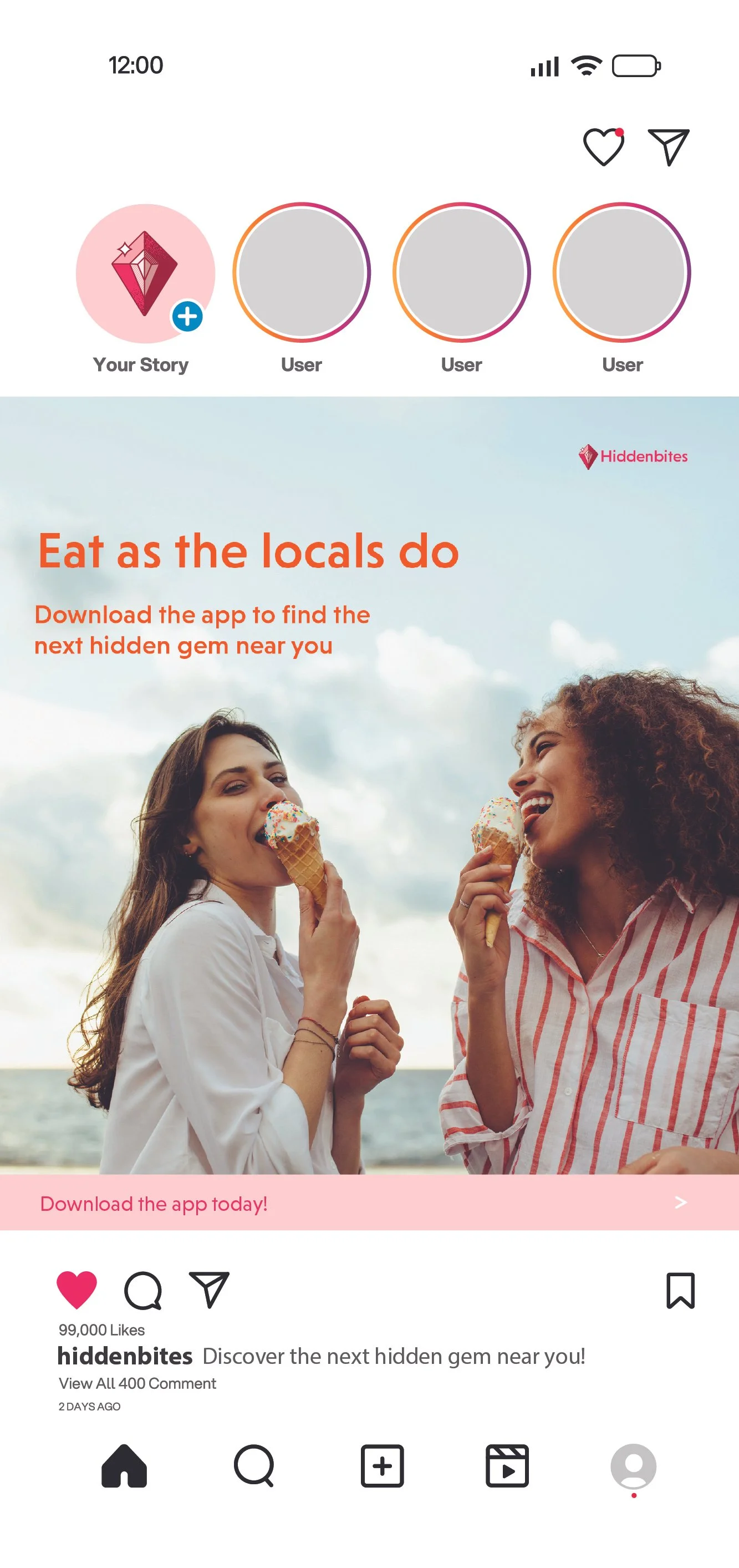
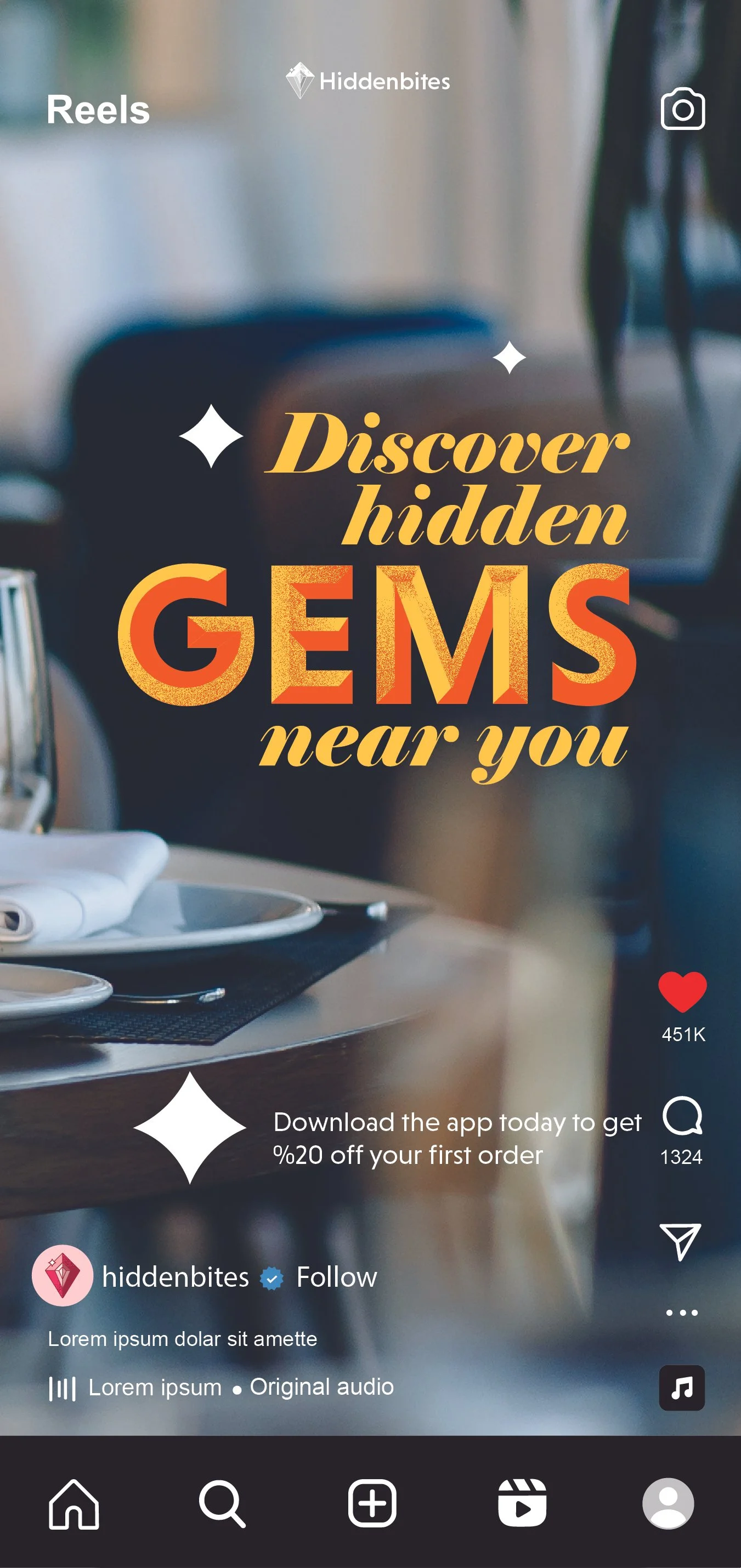
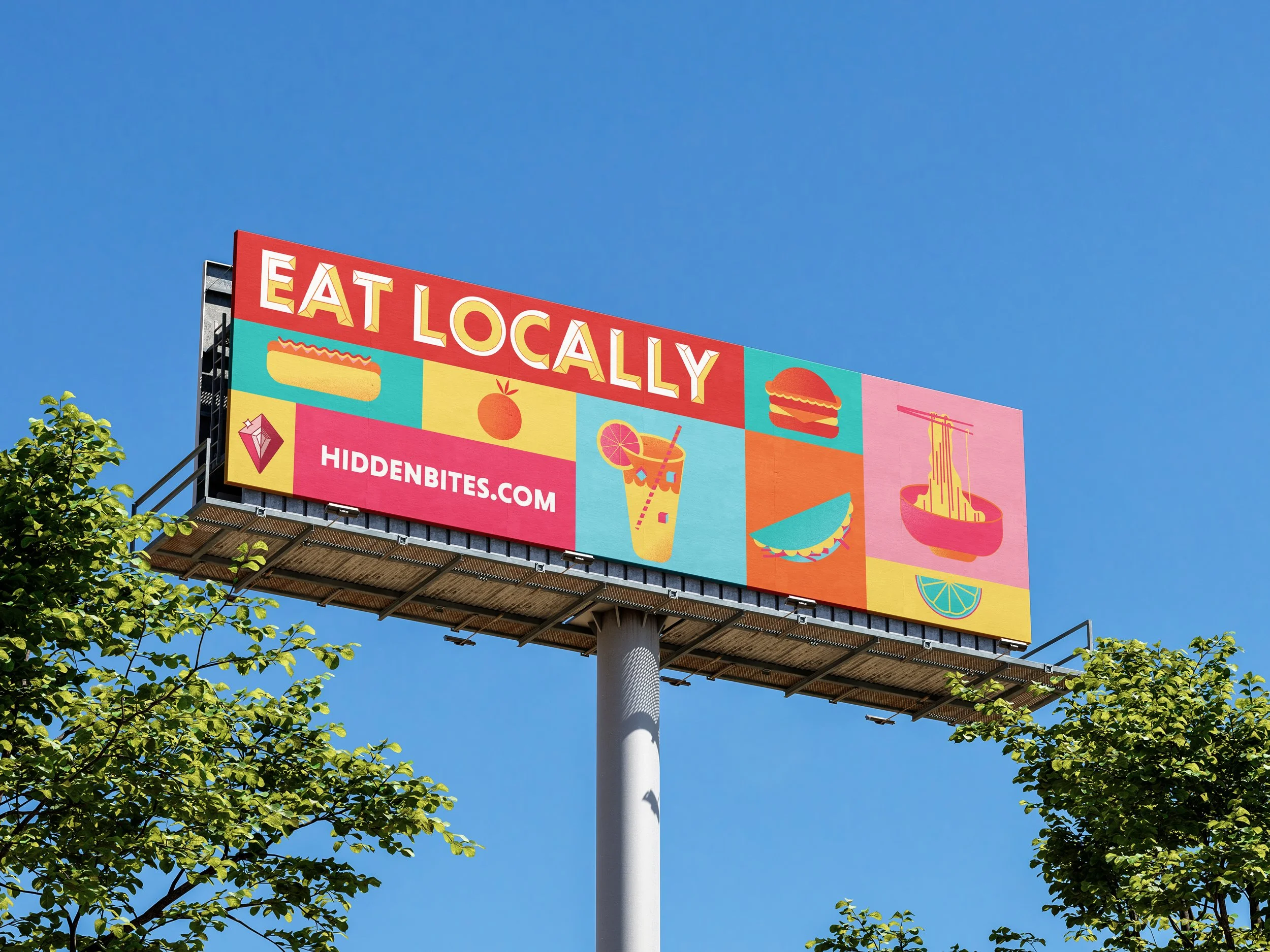
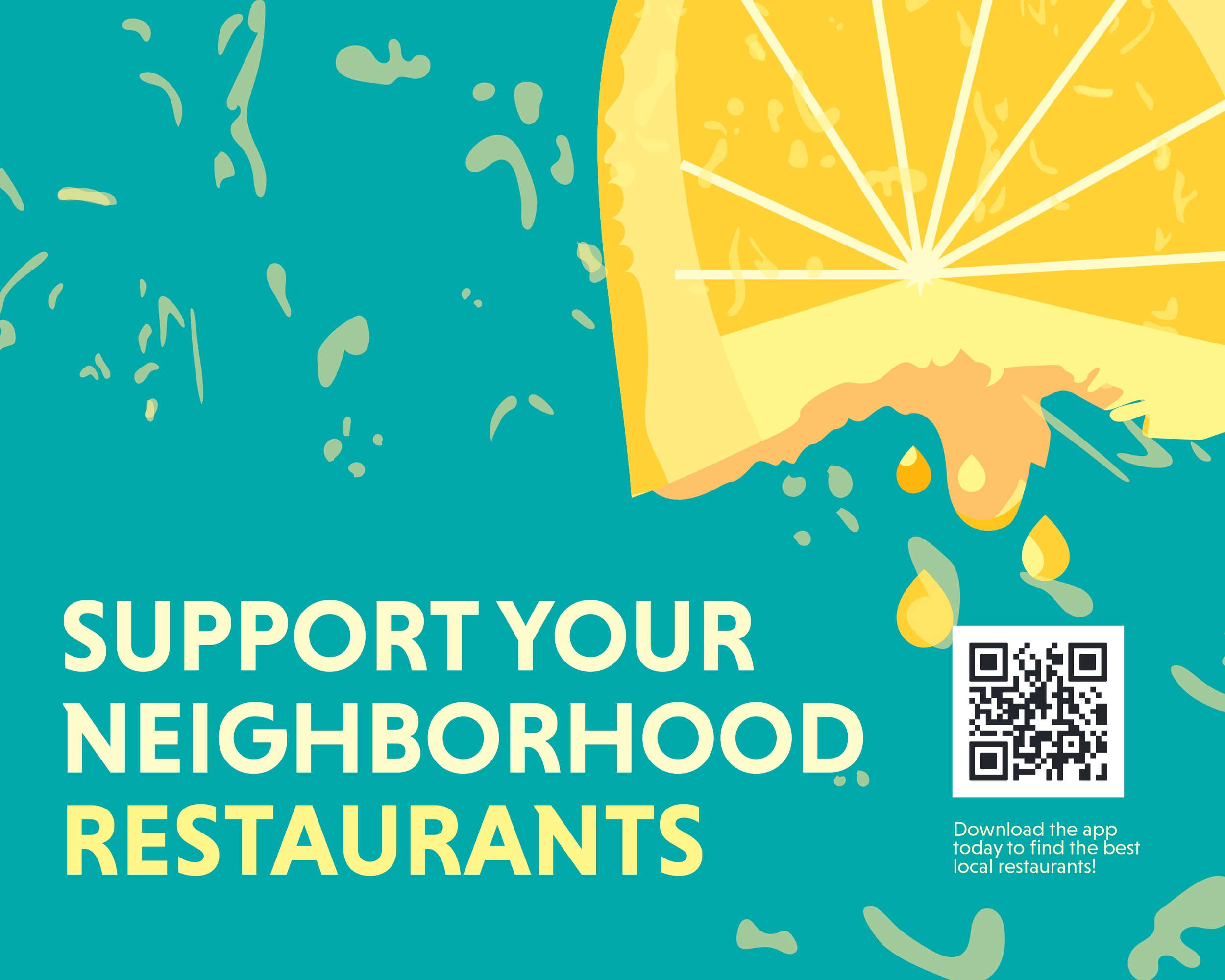
The awareness stage helps other find out about Hiddenbites. This app was promoted through an ad campaign, postcards that were sent to homes promoting the values of the company, a billboard, and environmental posters. The ad campaign ensures target audiences are reached through the different use of platforms and approach. For example, the Facebook ad, which is catered to the women in her late 60s, includes an image of an fancier dining table compared to an abstract illustration of a brick-and-mortar restaurant catered to gen z.
PLANNING
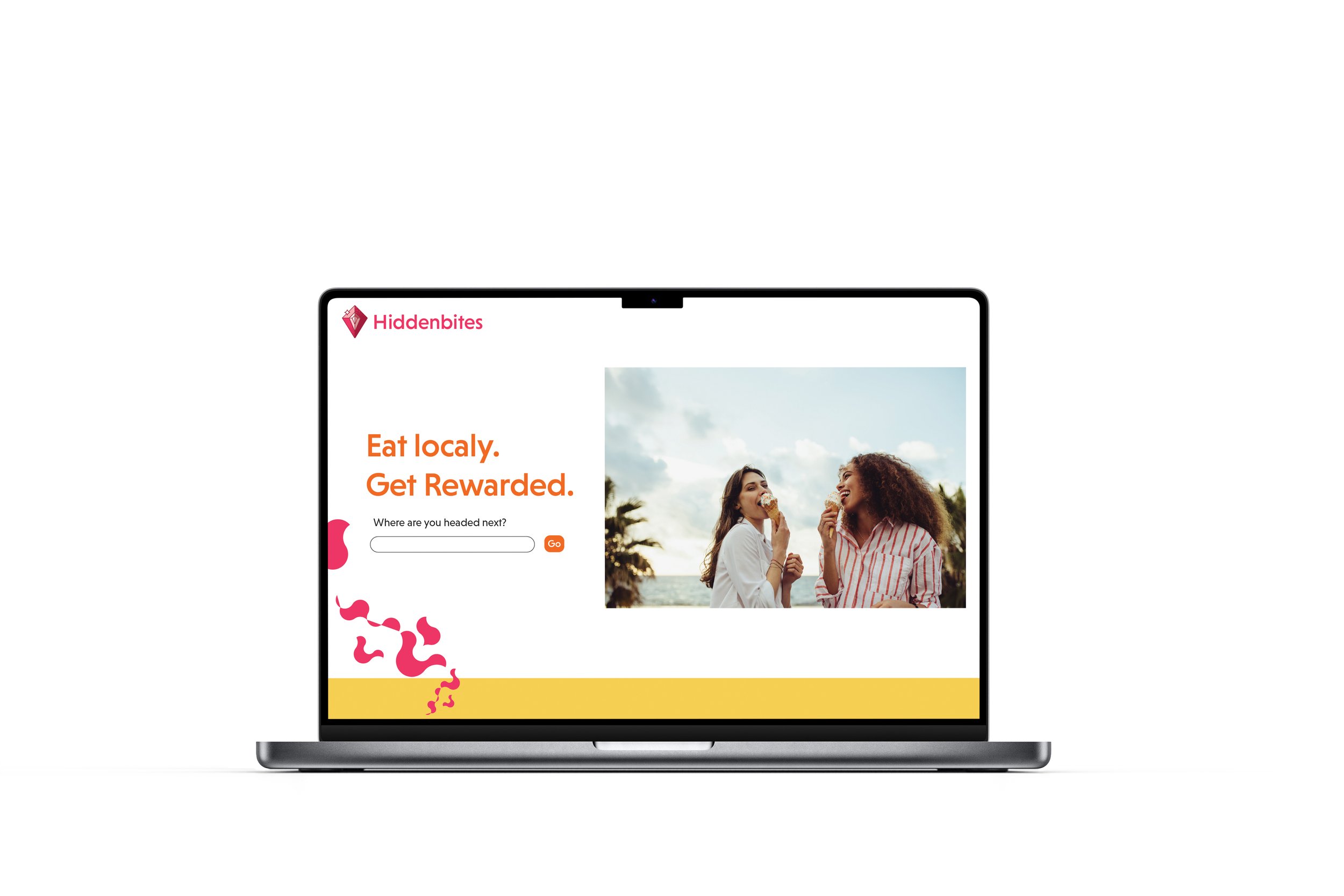
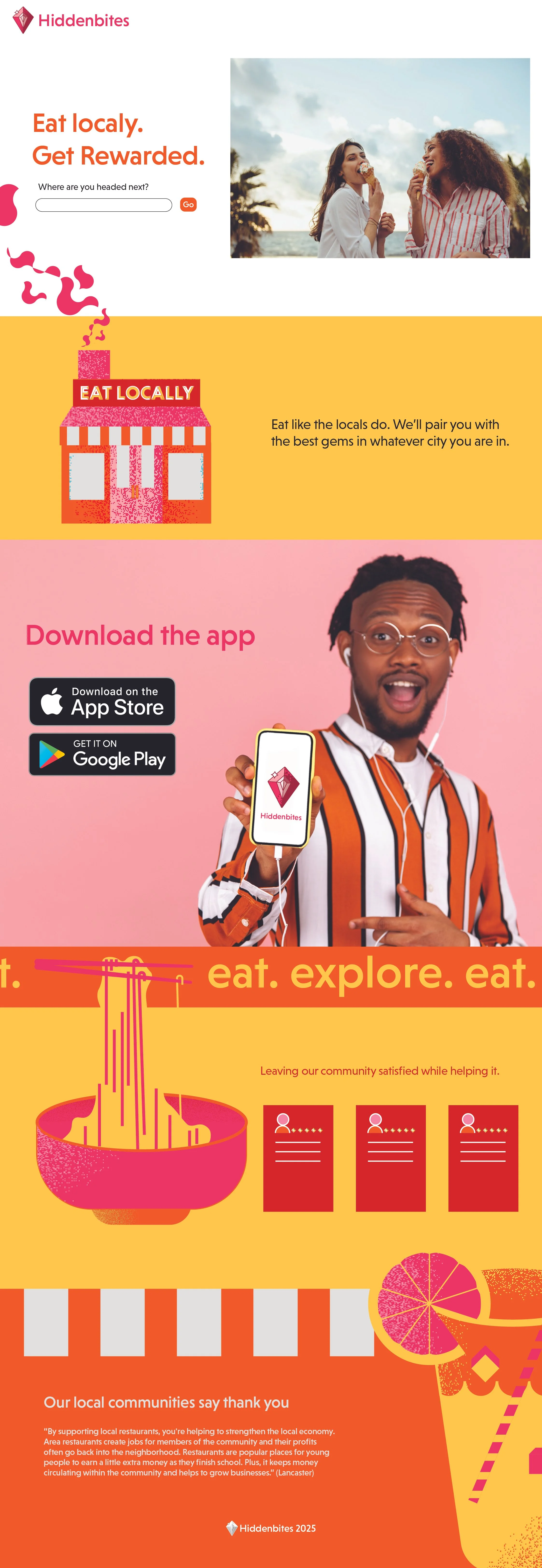
The planning stage includes a landing page to which people can began searching their next visit to the city. This then leads them to download the app or they can click the buttons below to also the same. Included in the landing page is consistent branding as well as positive reviews of the app itself to enhance trust in users.
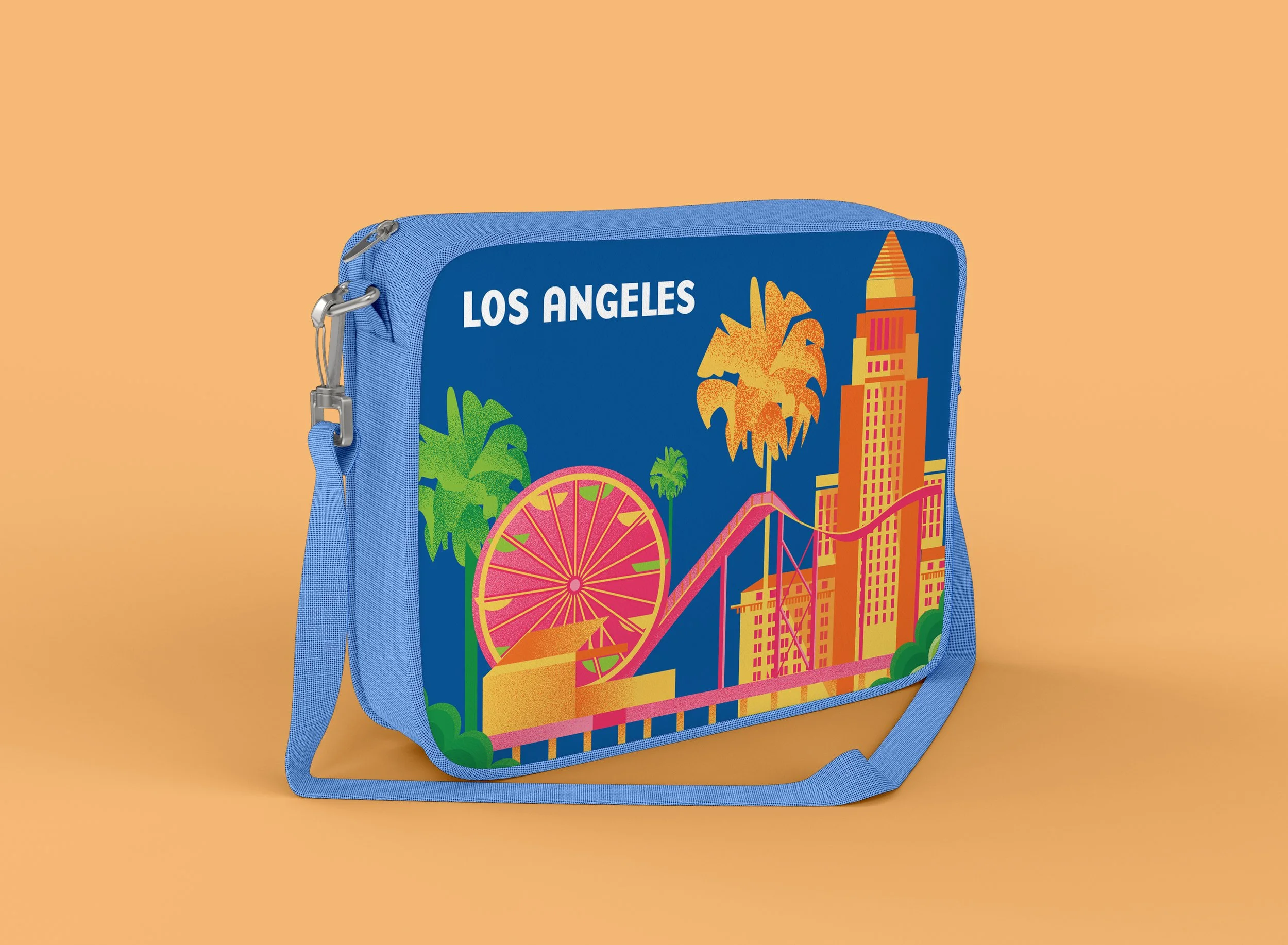
WAITING
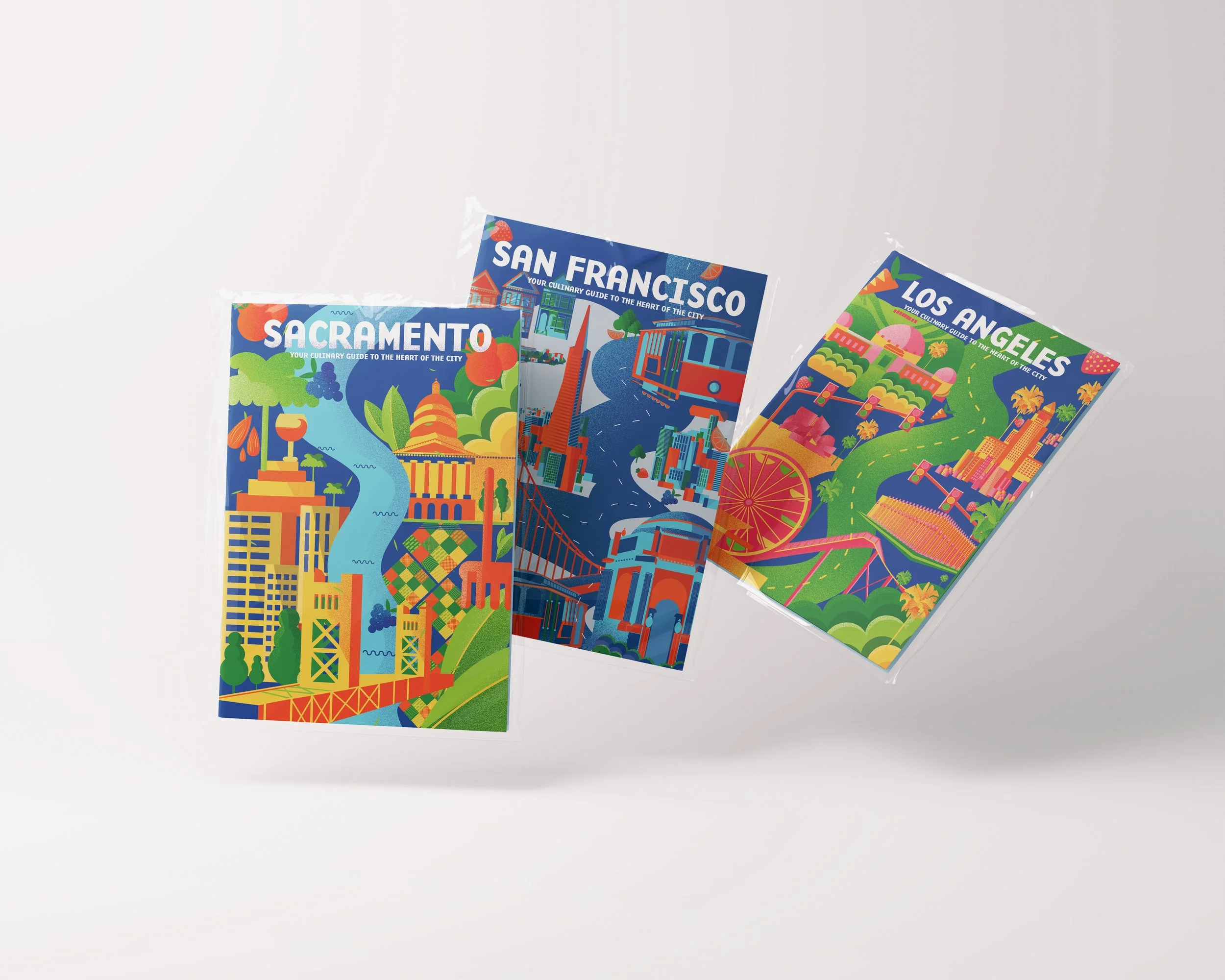
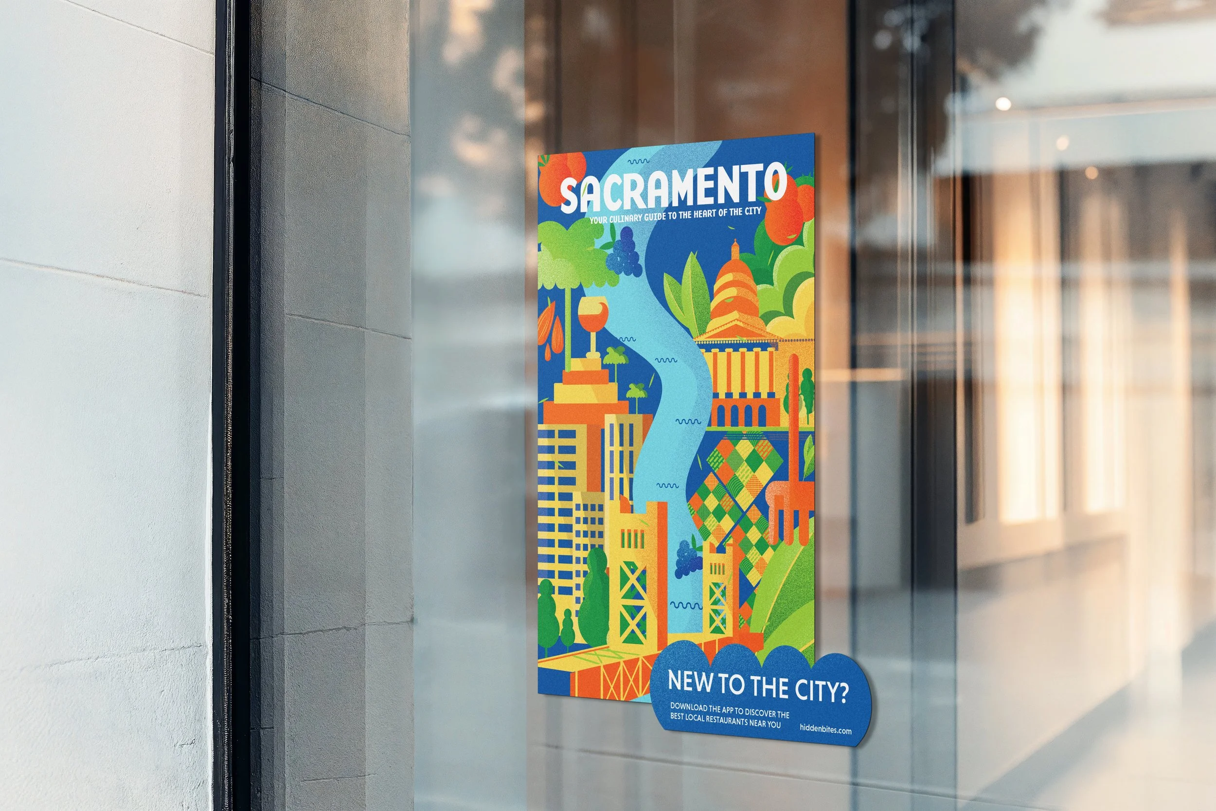
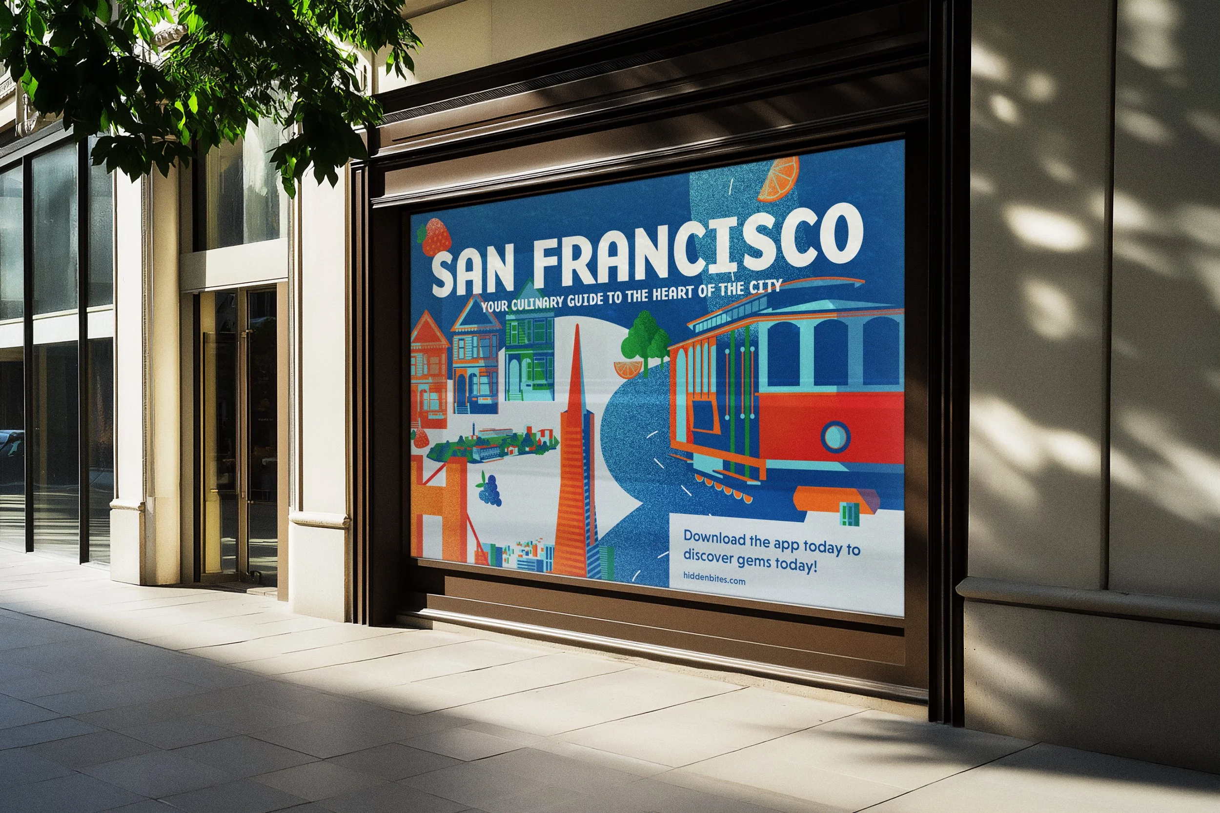
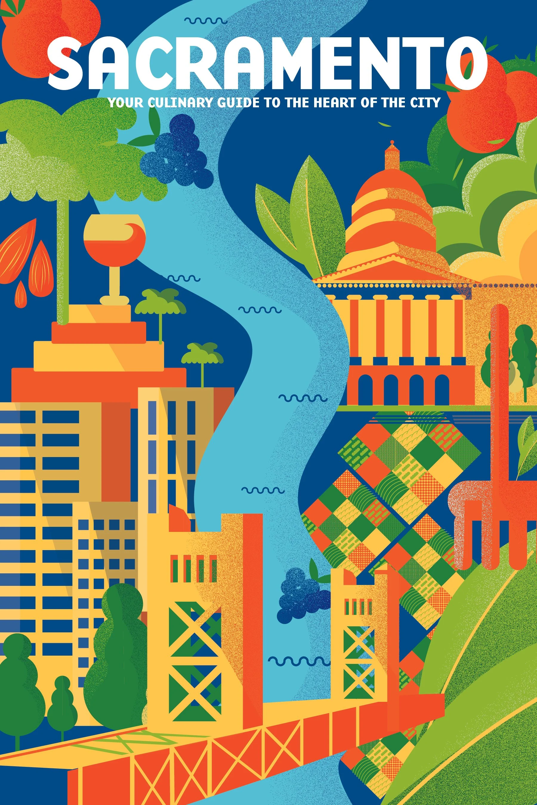
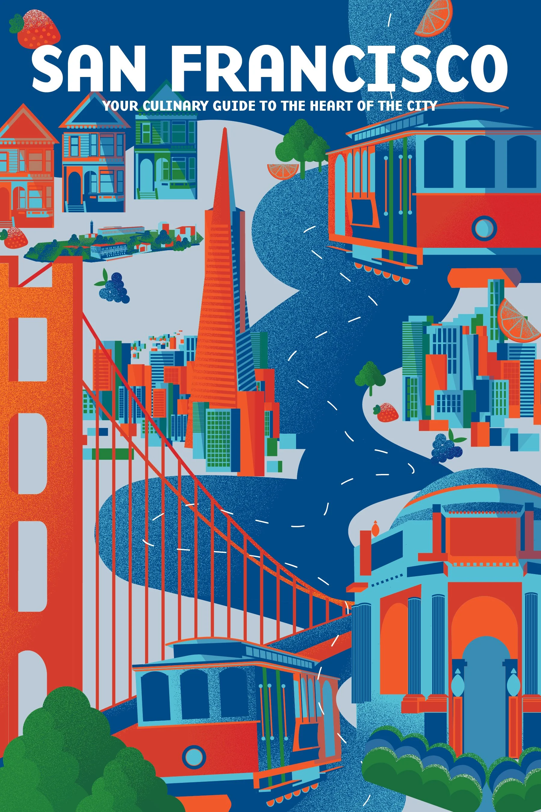
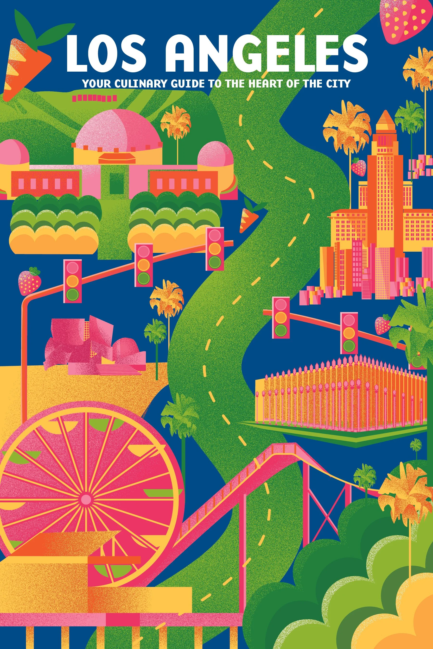
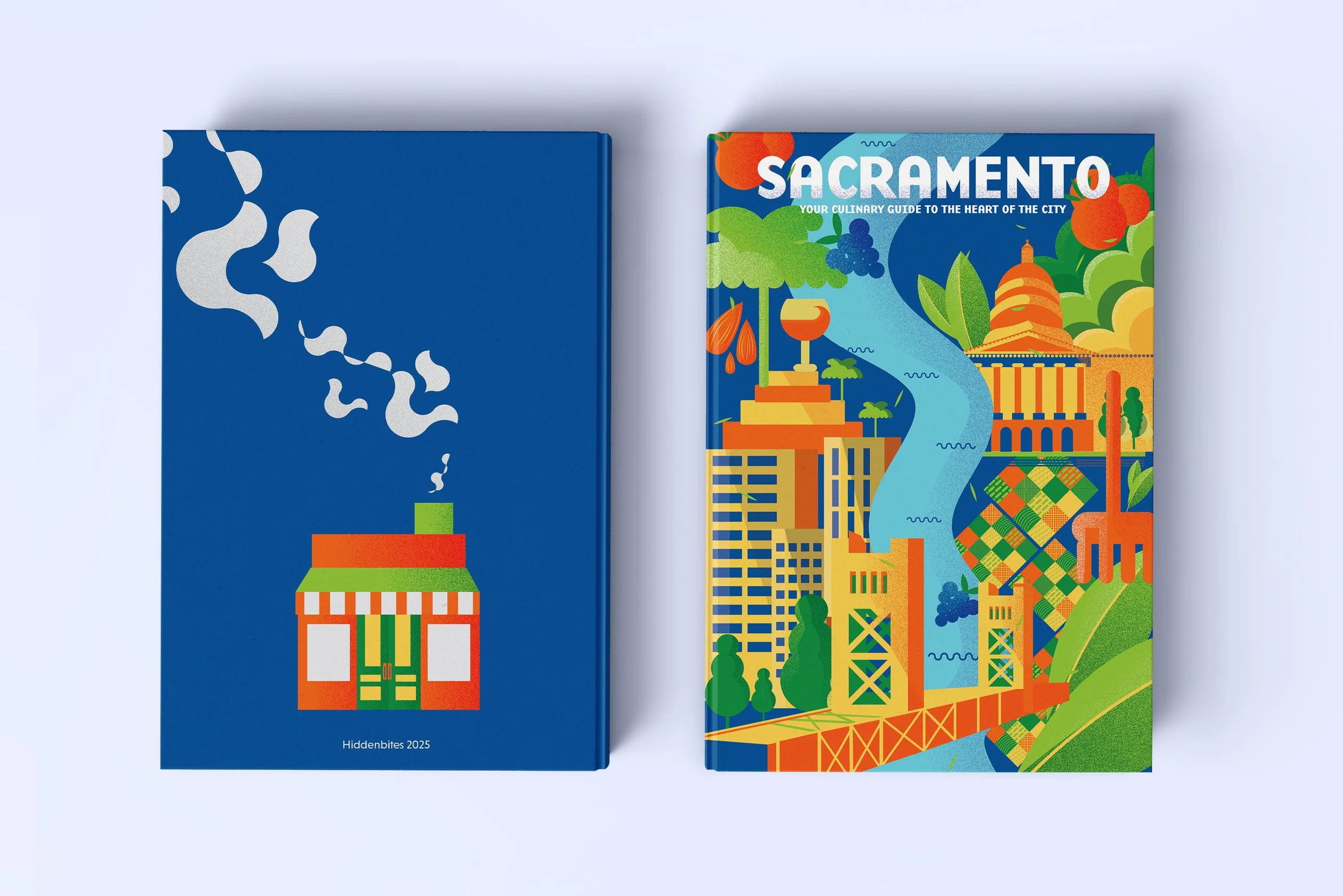
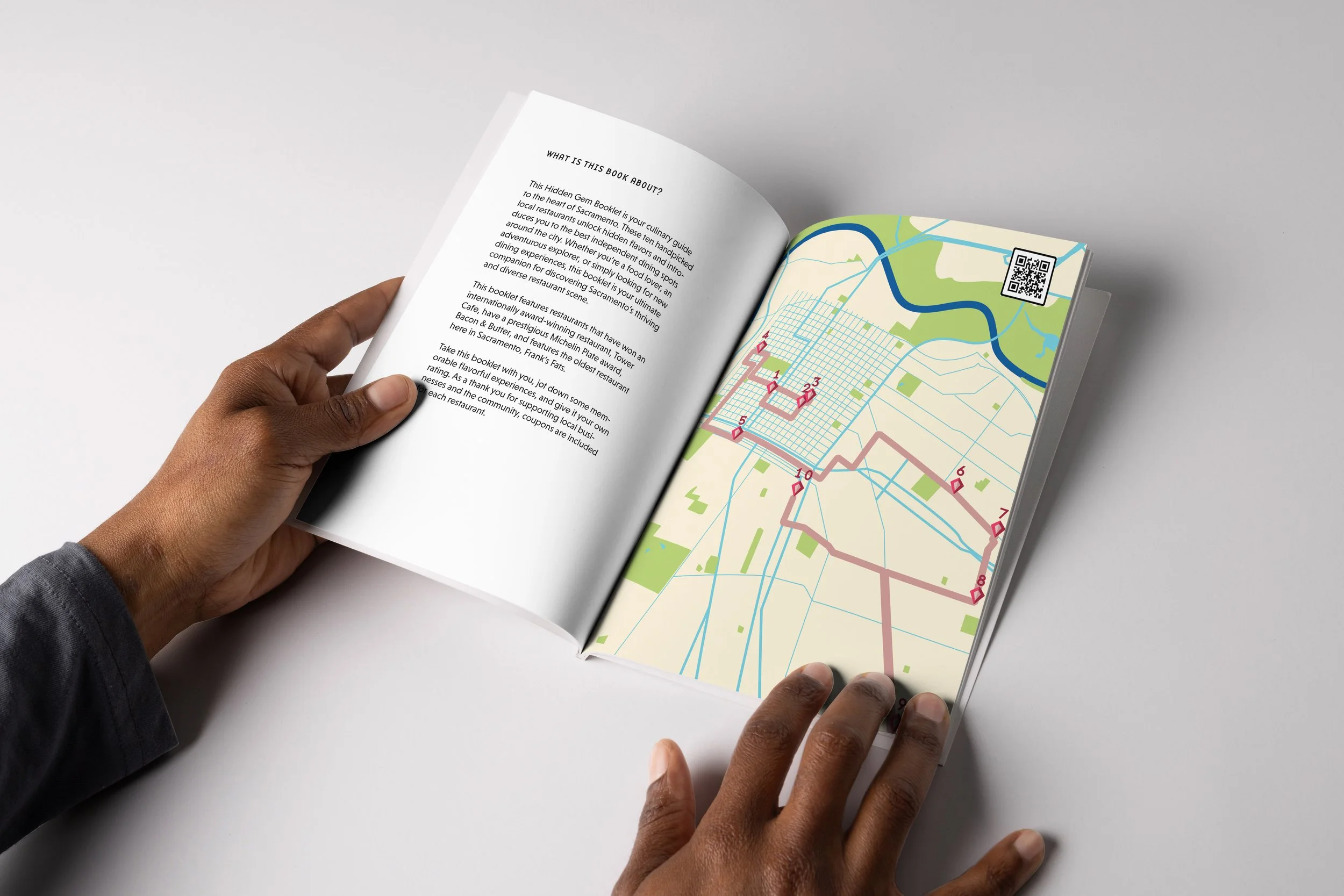
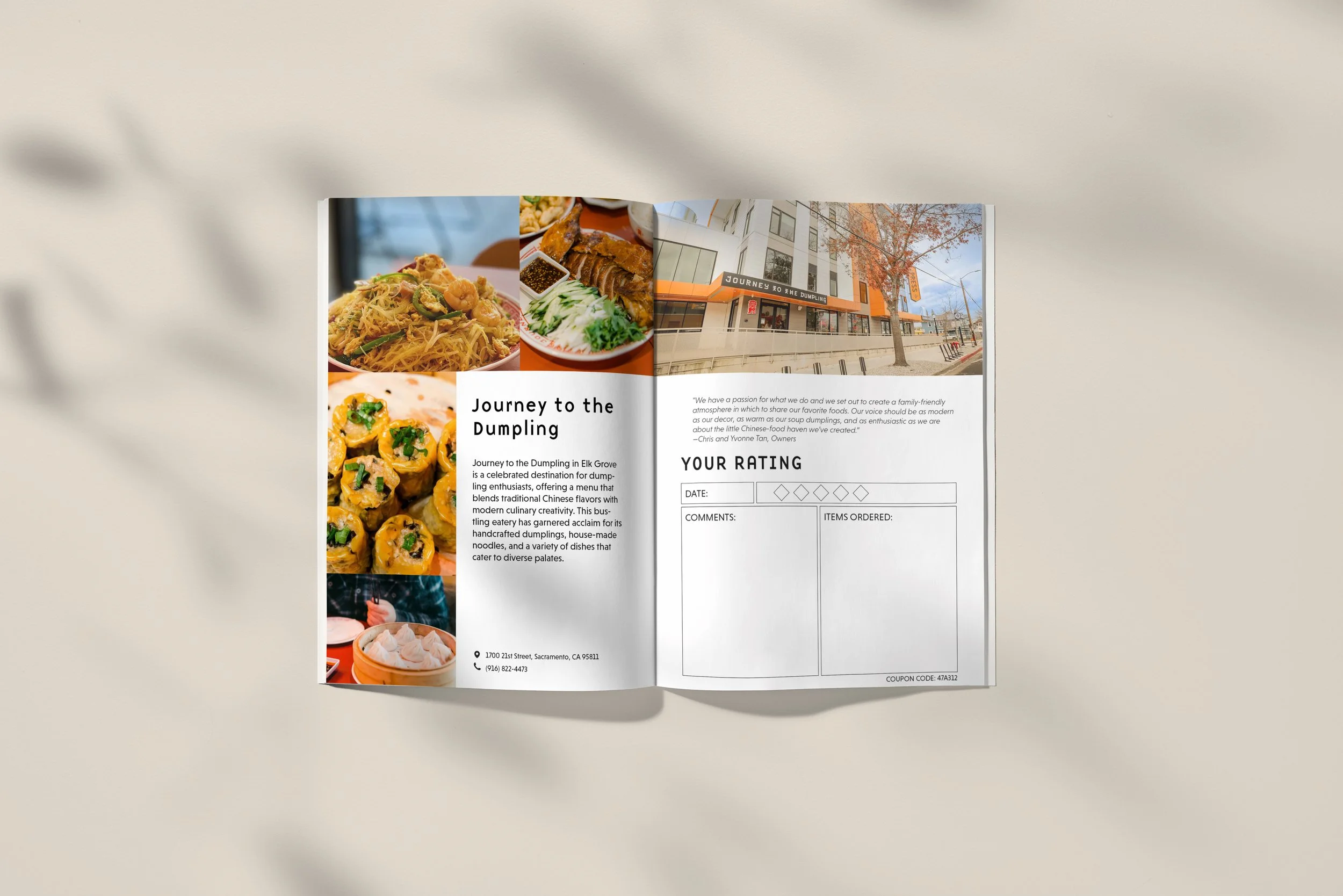
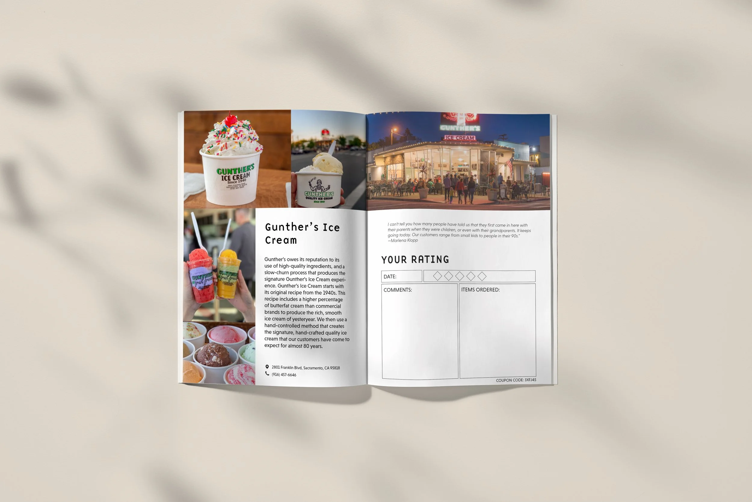
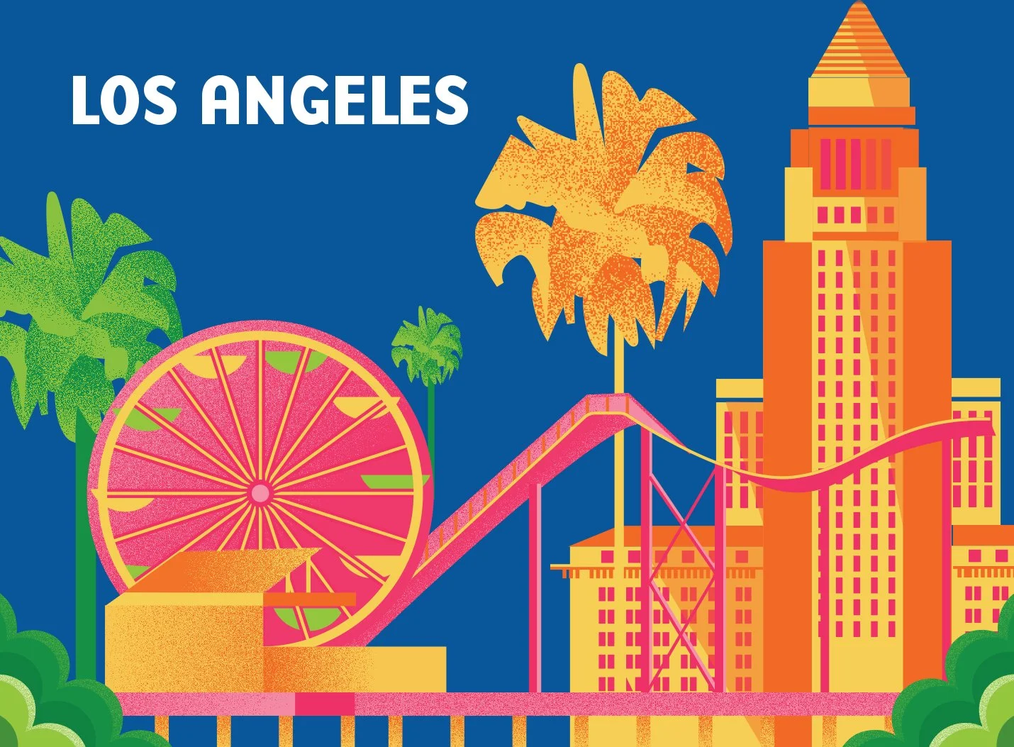
This is the part where excitement is built for their next trip. They will receive a booklet to the city they are visiting to which they can flip through the pages and fill out their experience once they are the locations. The covers were inspired by travel guides and illustrations to show the cities in a fun light, feature their landmarks, and as well as some local crops that each city grows.
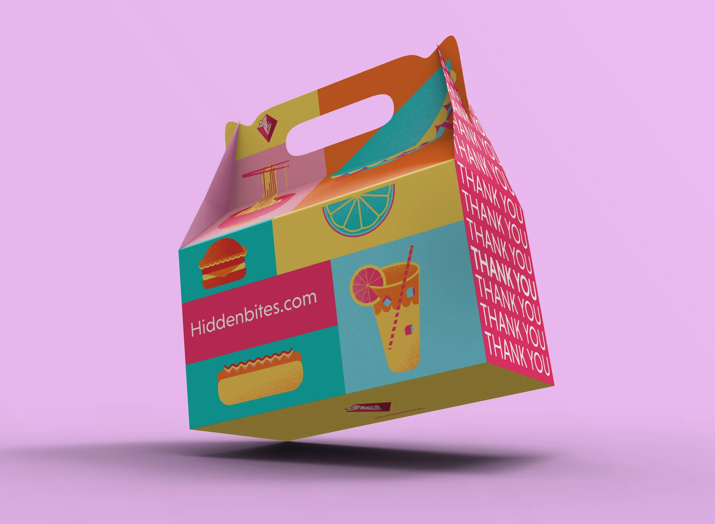
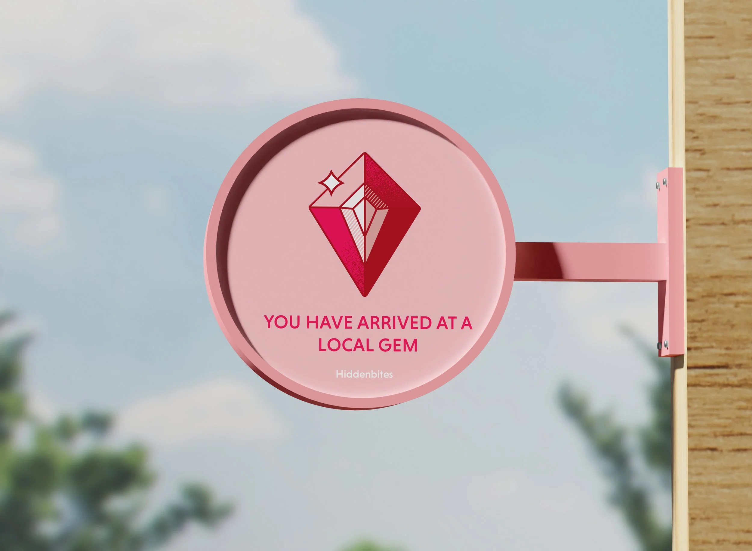
EXPERIENCE
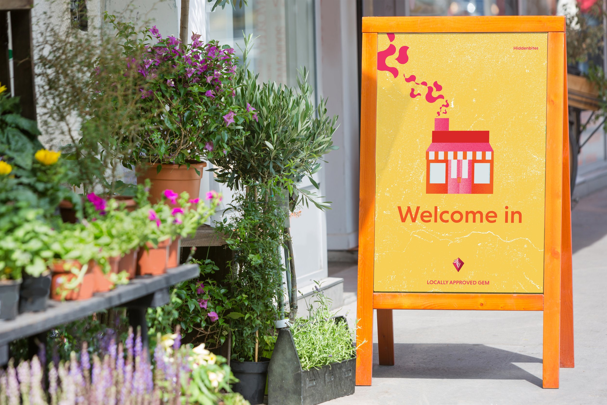
As for the experience, there are signage, packaging, and the app itself. The users can scan the app and they’ll get points to which they will be rewarded for choosing to eat at local restaurants. The signage is meant to showcase the partnership with the local restaurant and the app. The packaging was designed in mind with the popular “thank you “plastic bags, but in this form is a much more environmentally friendly packaging. This also adds to the feel of supporting your neighborhood restaurants.

Launch Screen
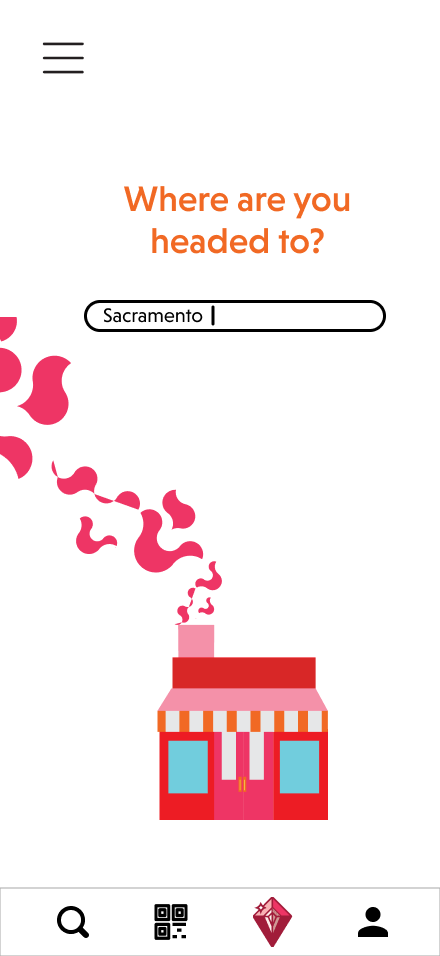
Search Field Screen
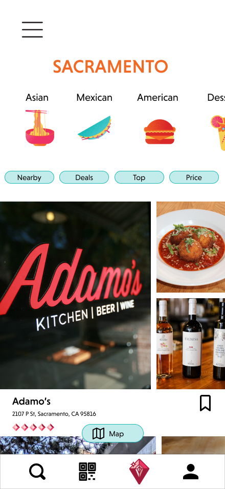
Local Sacramento Restaurants Screen
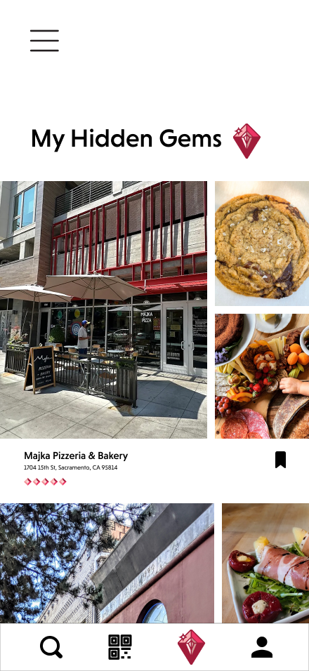
Your Saved Restaurant Screen
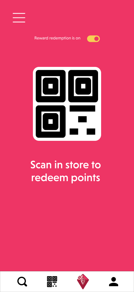
QR Code for Rewards
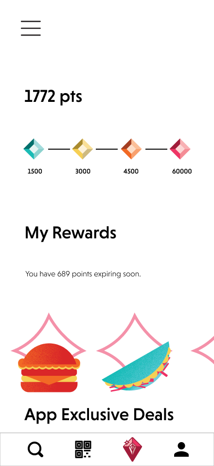
Reward Point System
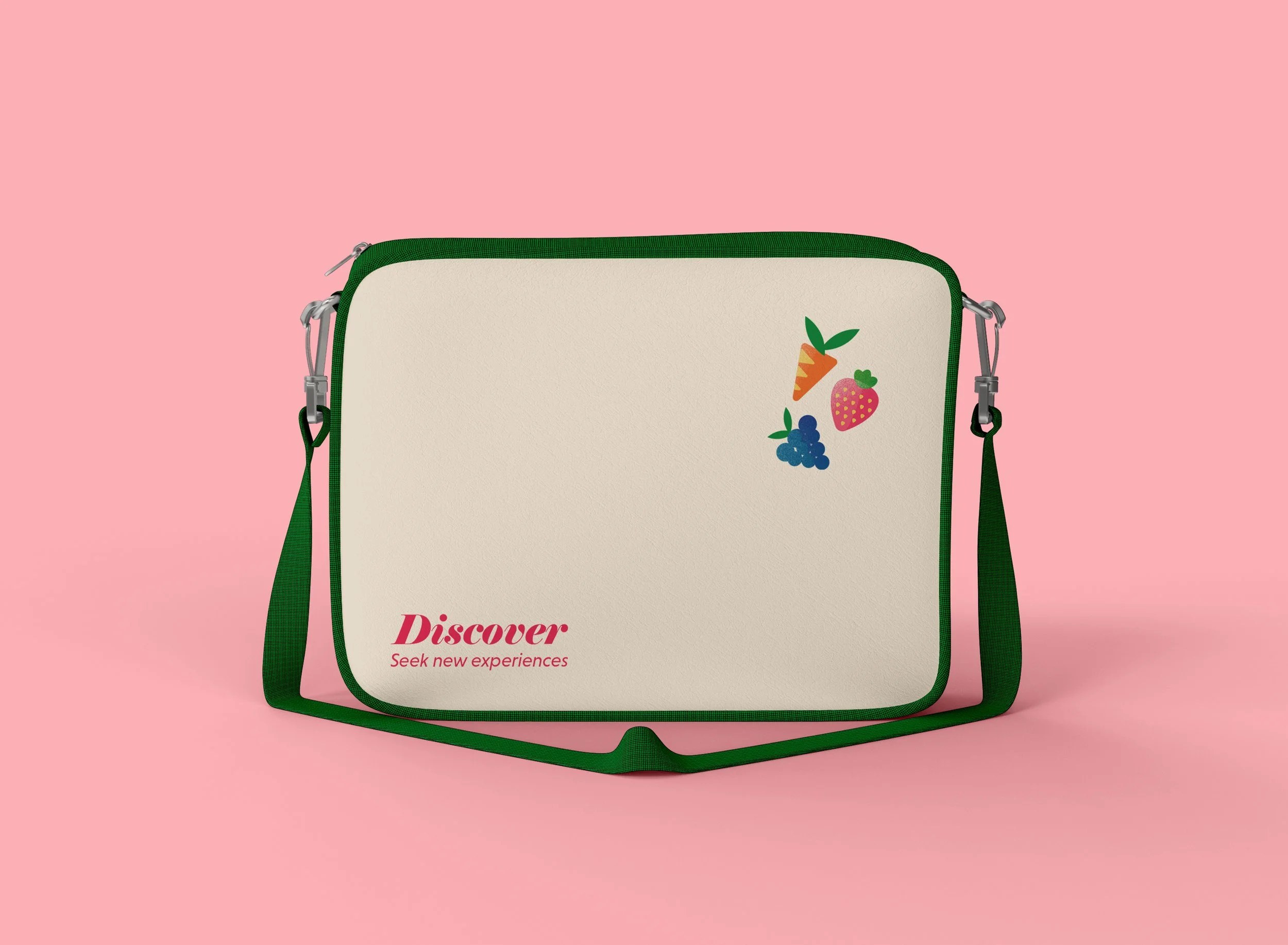
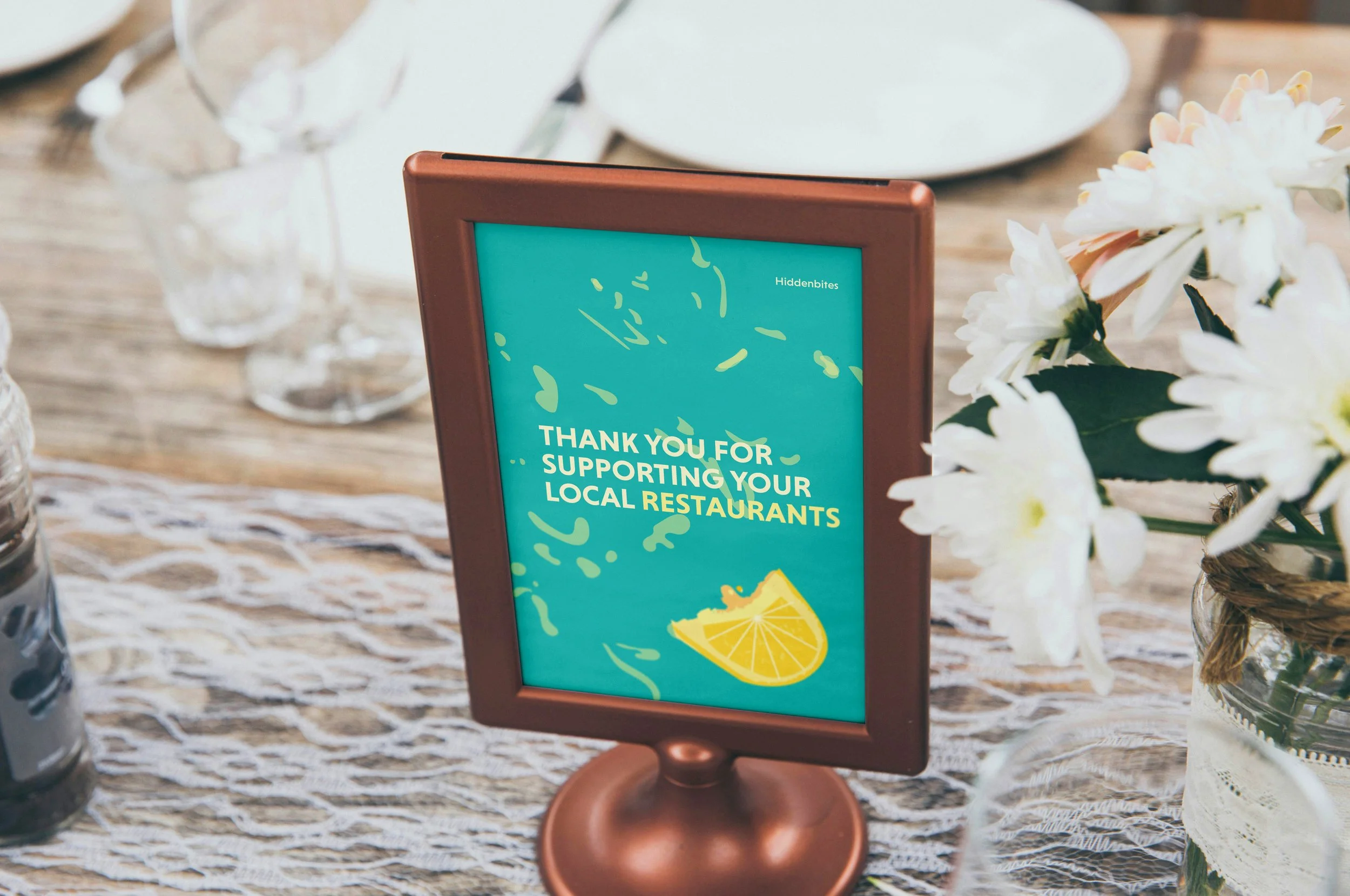
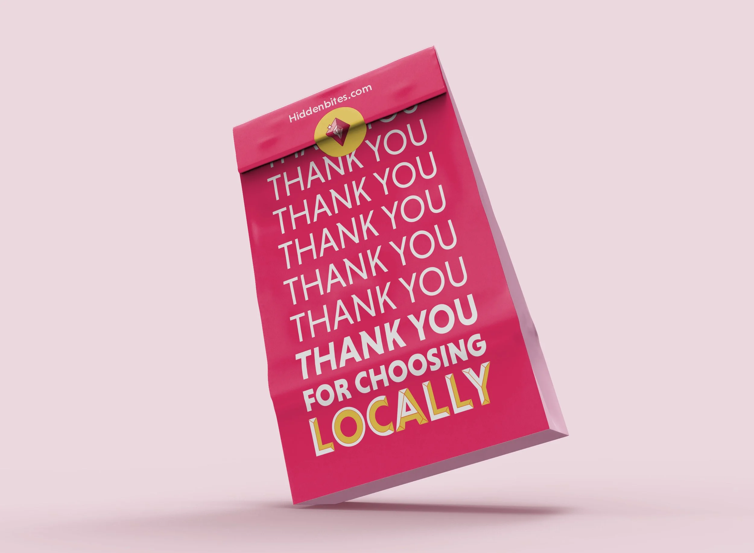
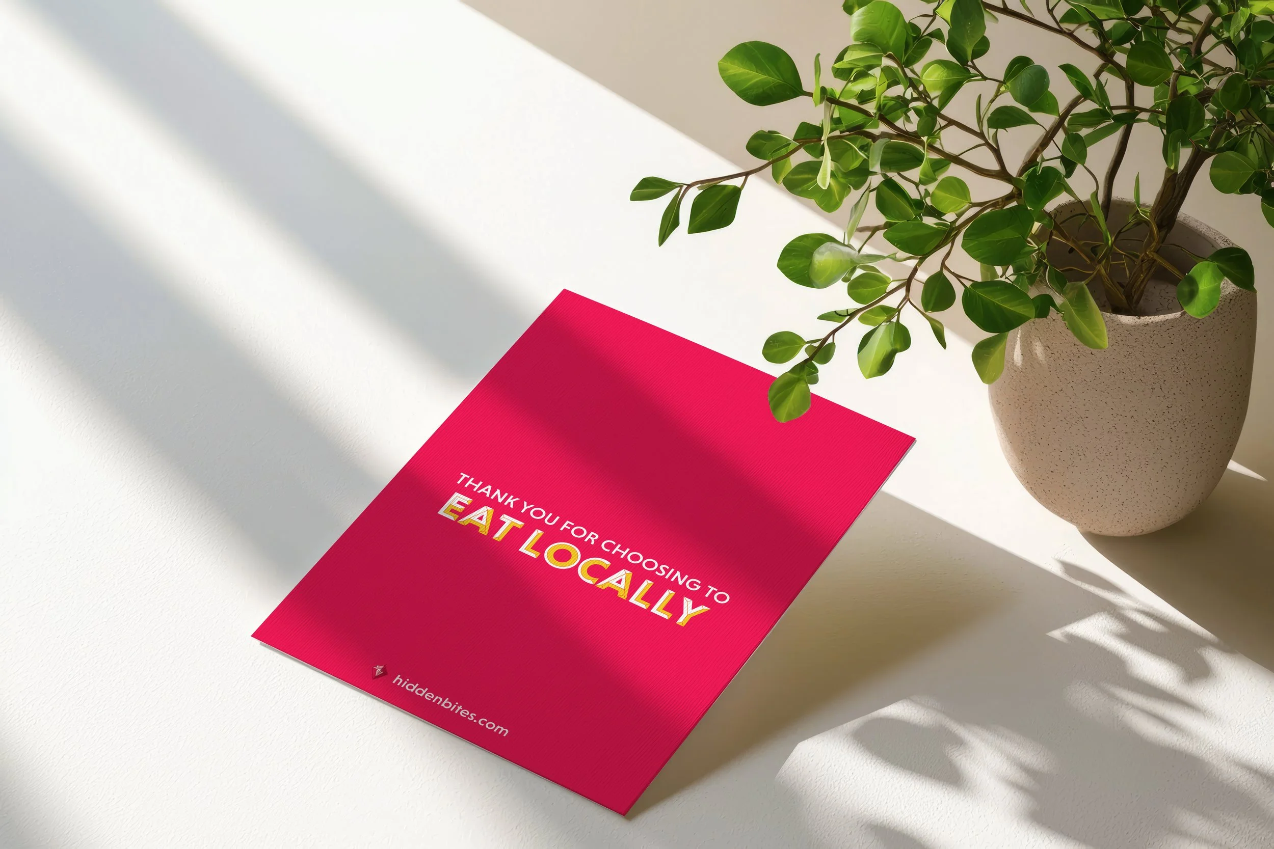
FOLLOW UP
Lastly, it is the follow up. Users will receive a thank you card as well as merch as a way to make it memorable for them. The merch was designed so that others can wear it to not necessarily promote the brand, but more so for the users to be in support of the brand which is why the branding pieces were a major component to the design and not the logo.