PUNCH LINE SACRAMENTO
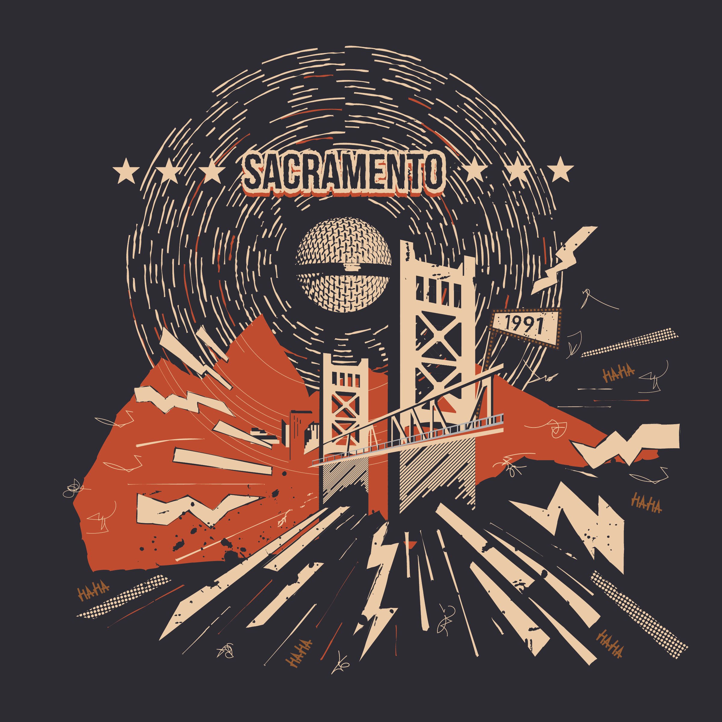
I approached this design by incorporating elements that represent boldness, uniqueness, which are qualities of both the club and Sacramento. Drawing inspiration from the aesthetics of references provided, I aimed to create a graphic that is rooted in the spirit of both the club and the city. Tower Bridge, which is a recognizable landmark of Sacramento, anchors the design. I created an abstract style using the light and shadow with the brand colors to create depth and intrigue. The large shape behind the Tower bridge in the color “Brick” is an abstract representation of Sierra Nevada mountains in reference to the local scenery. The focal point of the graphic is the top of a microphone which subtly doubles as the moon, just as like Punch Line Sacramento’s mural has the iconic moon in the background. This duality adds a layer of cheekiness and cleverness to the piece without being too literal. The lines surrounding it are emanating soundwaves which also resemble light emanating from the moon to capture the visual importance of comedy and storytelling. The lighting bolt graphics, squiggly lines, rectangular shapes, halftone patterns, and the “haha” text bursting out of the Tower Bridge are representative of the impact of when a joke lands. These graphics are inspired by comic books to visually represent the humor and energy of a joke landing, striking the city. Visual elements that tie it back to the club are included without being overly branded such as the stars from the Punch Line logo and founding year, “1991” sign emerging from the front of the bridge. Overall, this is a visually layered graphic that incorporates elements from both the city of Sacramento and Punch Line Sacramento that is fun, clever, and recognizable.